athenahealth / State of the Smart Campaign
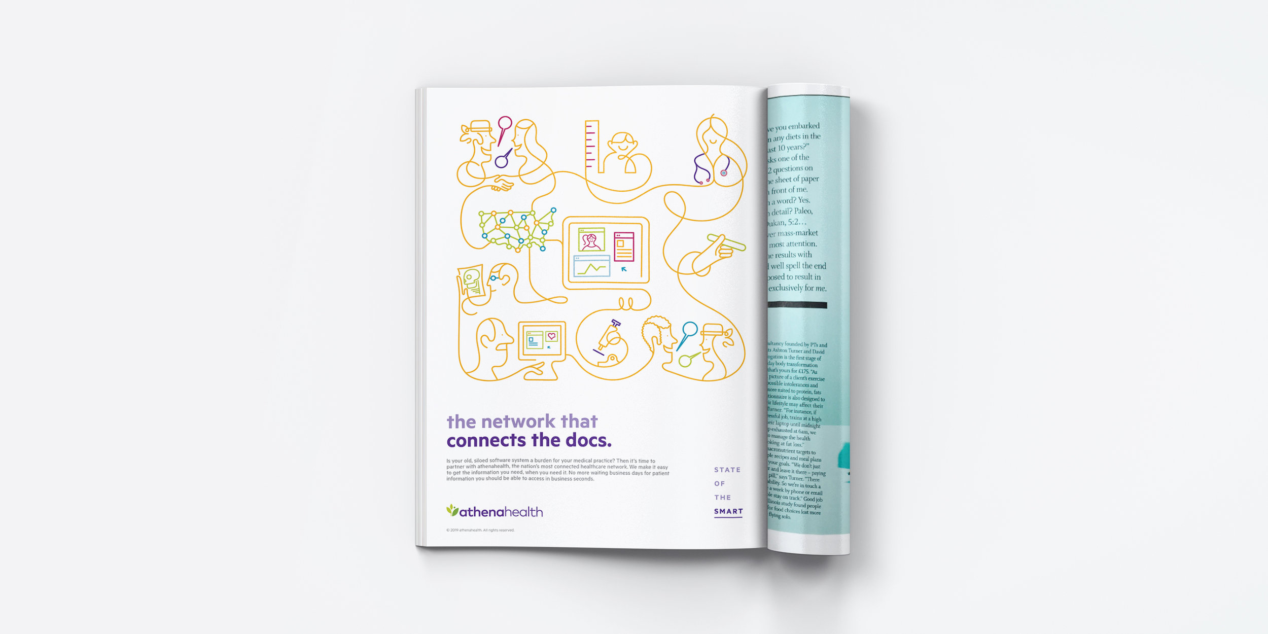
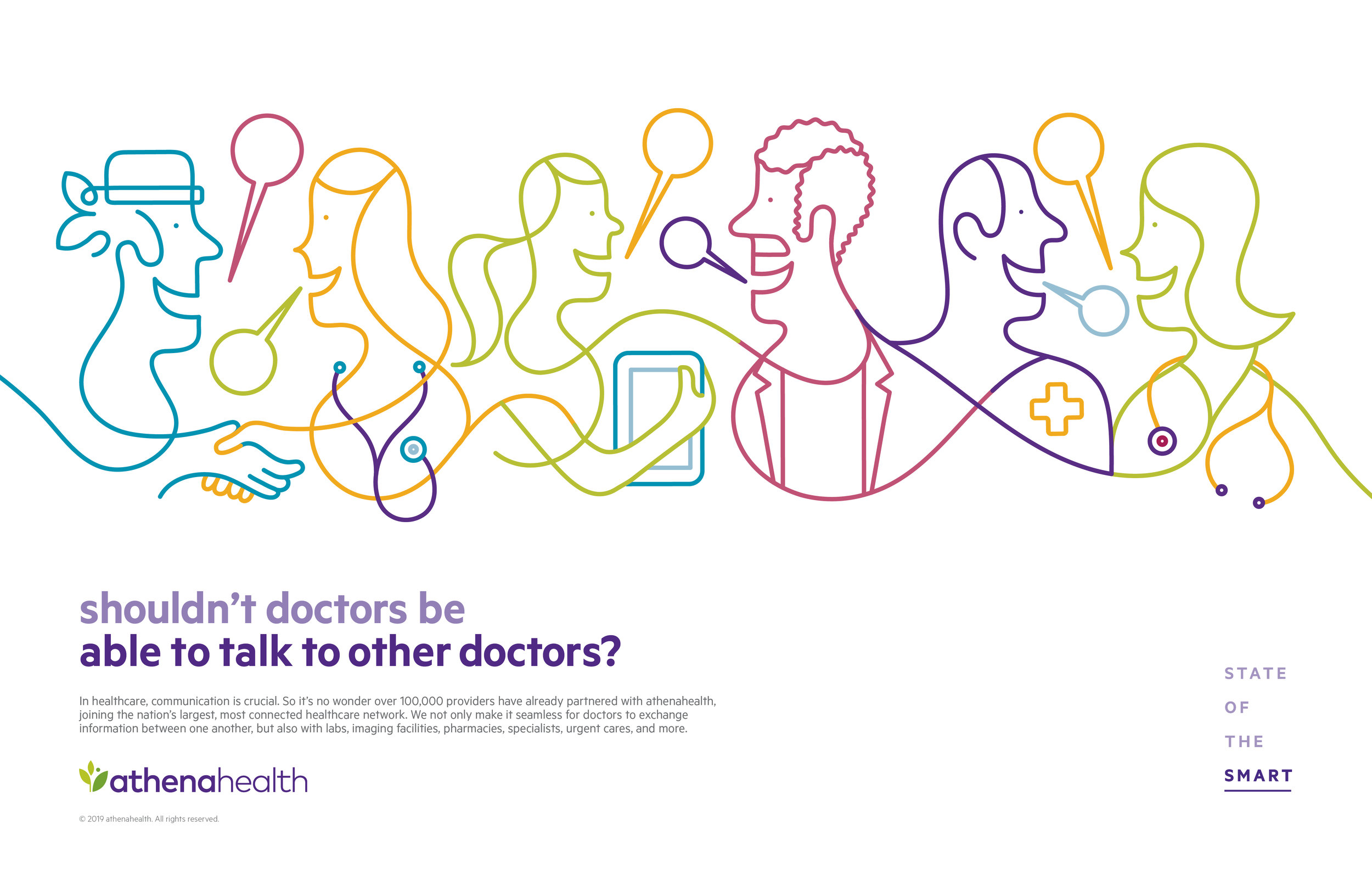
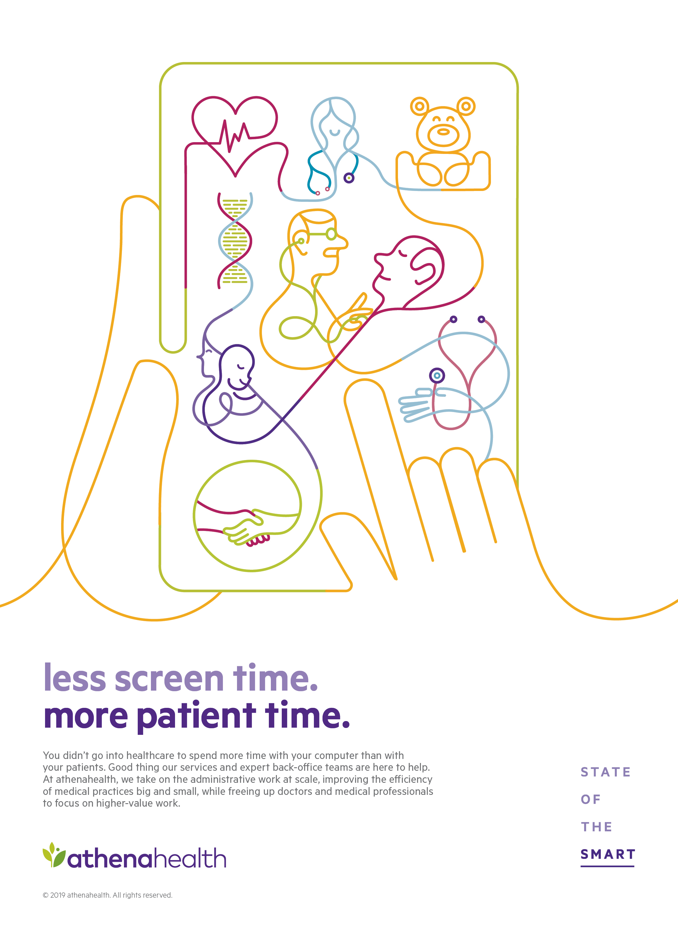
When you look at medical advertising – it’s a visual sea of sameness. Hundreds of medical brands pull from the same stock photos of smiling doctors and overuse the colors green, blue and salmon. It’s hard to stand out.
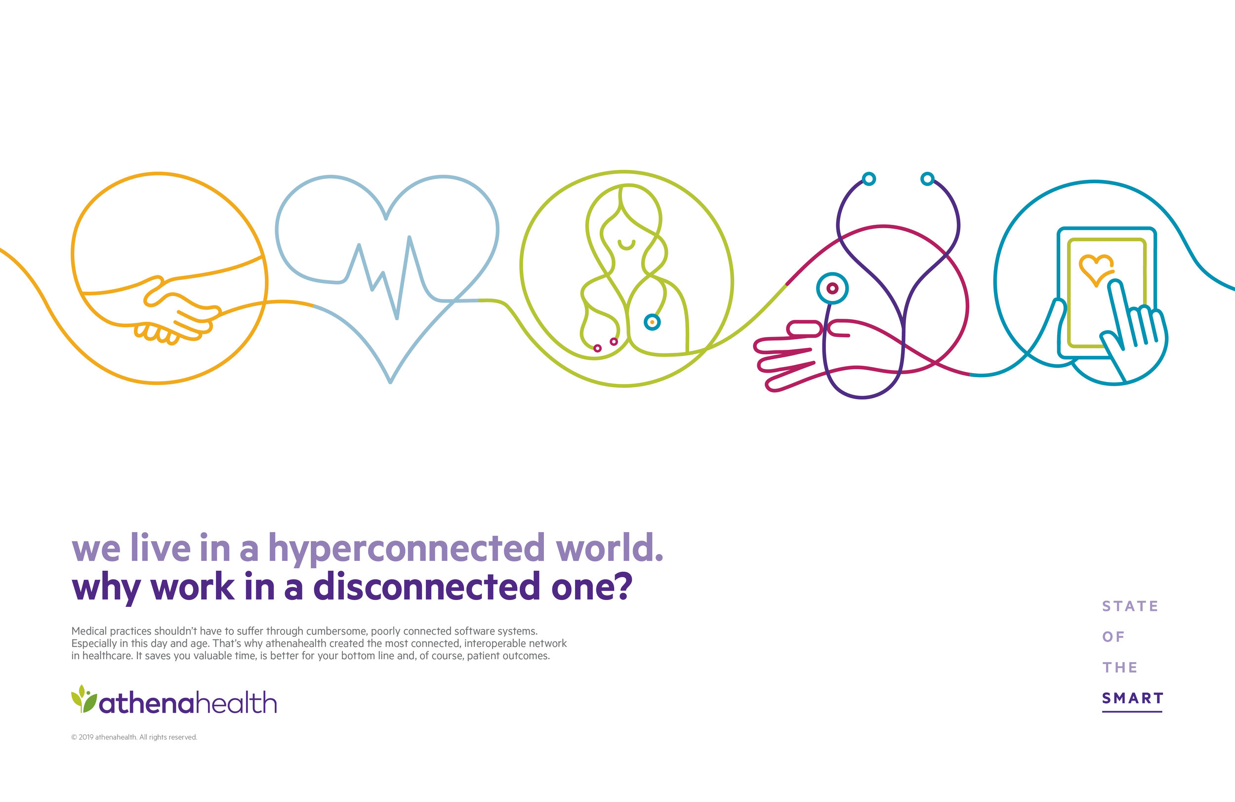
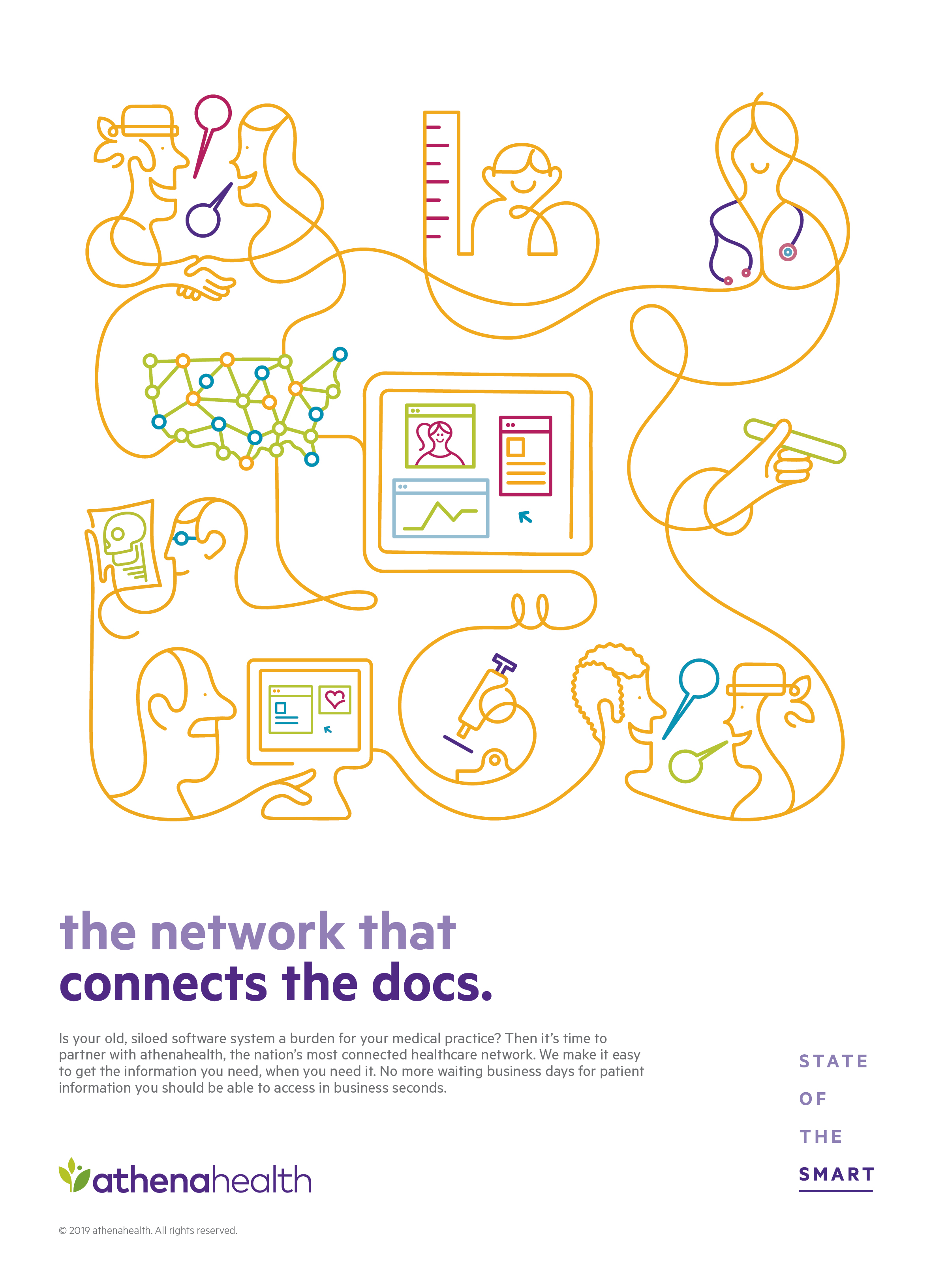
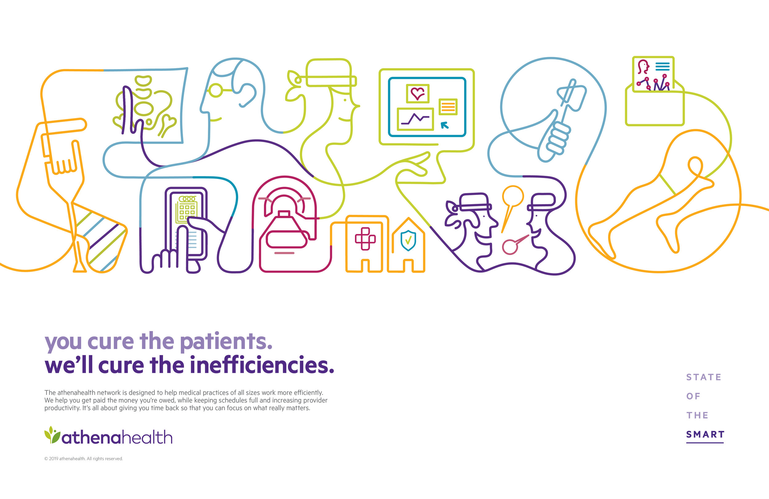
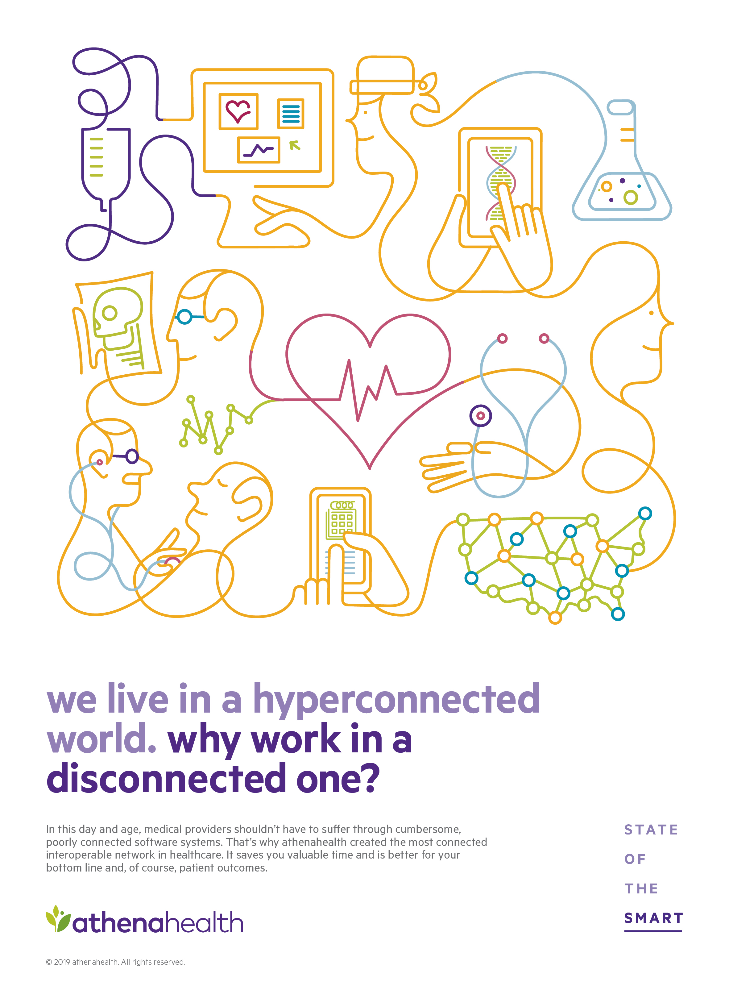
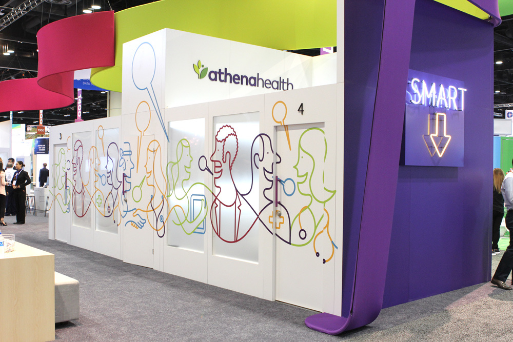
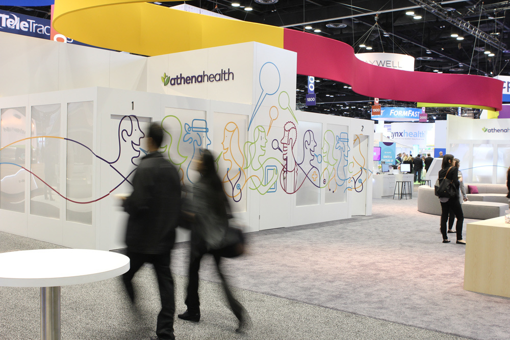
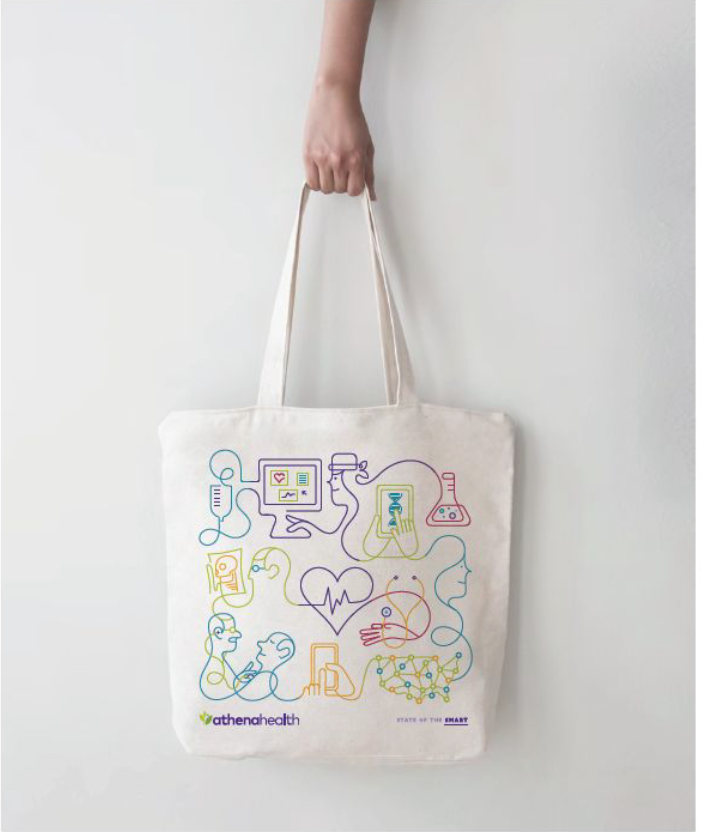
For our 2019 Brand Campaign we wanted to do just that. We created interconnected illustrations for print, OOH, digital and video that not only pushed against the category, but visually brought to life athenahealth’s interconnected healthcare network.

OOH

THE CATEGORY: A SEA OF SAMENESS

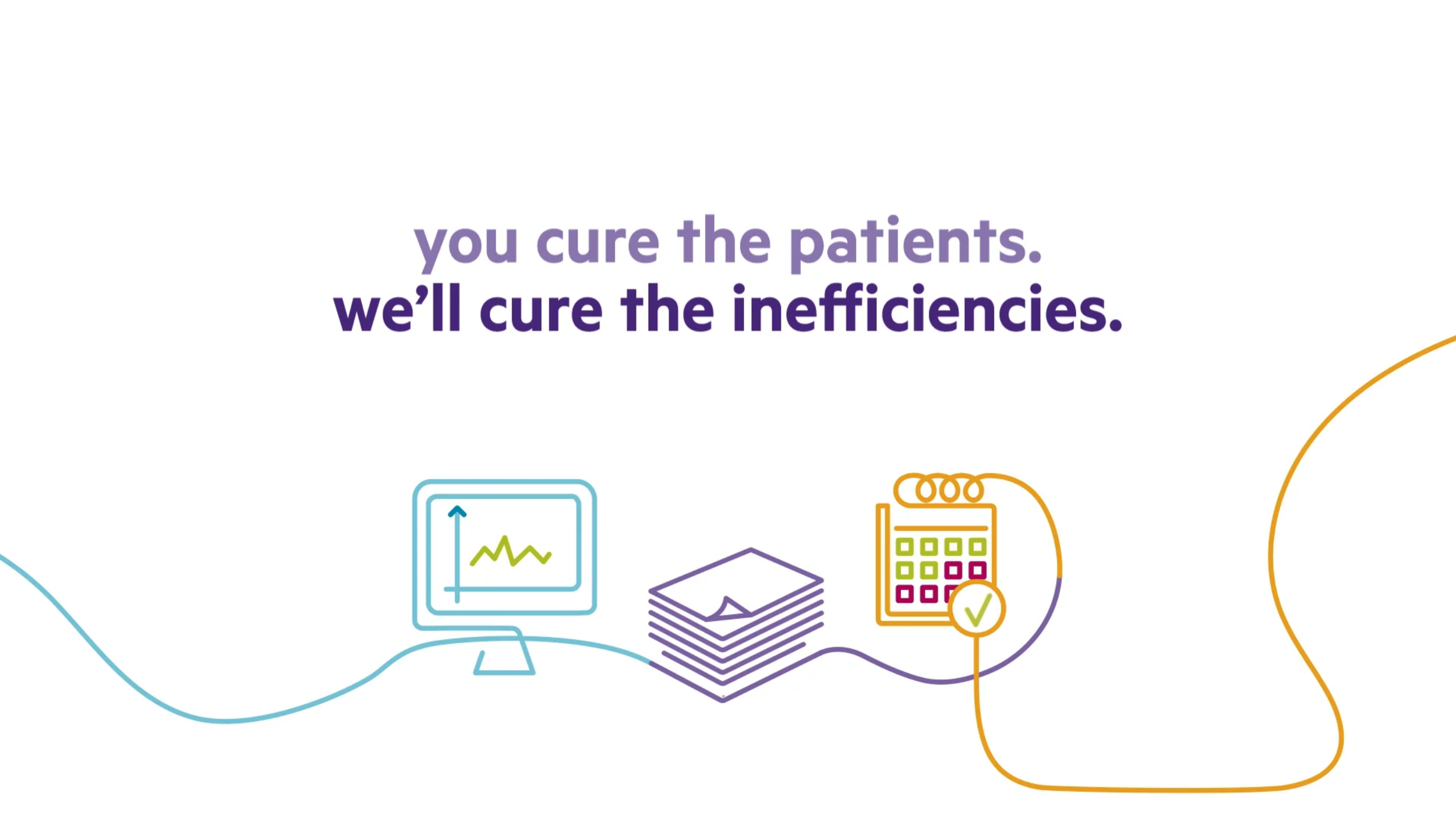
:15 Animated VIDEOs


Design Elements
Elements with Motion


TRAIN WRAP

TRADE SHOW DISPLAYS

:06 Animated VIDEOs